
Germaine Kruip (b. 1970)
Counter Shadow

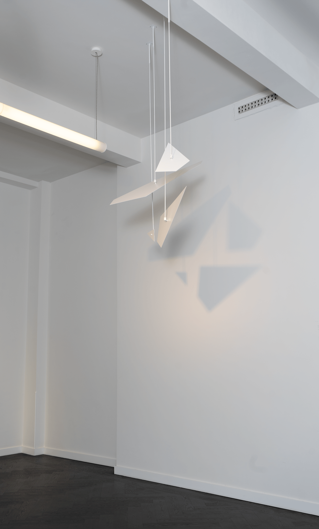
The work Counter Shadow by artist Germaine Kruip is both a shadow painting and a hanging sculpture. A special daytime spotlight illuminates a mobile, creating a (rotated) shadow version of Theo van Doesburg’s 1925 painting Contra-composition VI on the wall behind. Together with Mondriaan, Van Doesburg was one of the leading figures of the artistic movement De Stijl in those years. Strict beauty standards were said to lead to a “universal truth” and, ultimately, a better society. In his urge to compete with Mondriaan, Van Doesburg turned to diagonal compositions and dissonant colour combinations, which at the time led the dogmatic Mondriaan to distance himself from his colleague.
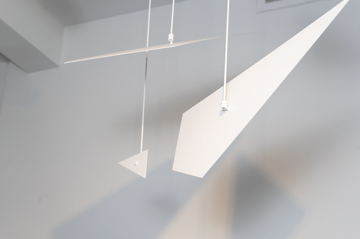
The mobile of Counter Shadow is a deconstruction of the painting from which the original light-coloured areas have been cut out and reduced to four separate parts. Installing the work is a painstaking job. The painted aluminium shapes must be fixed at exactly the right height and distance from each other and the lamplight must be installed at the correct angle and intensity to obtain a sharply defined shadow. Despite the precision involved, ironically, it is natural daylight that, depending on the season and the weather, causes the sharp edges of the projection to blur. This non-rigidity contrasts with the strict character of the De Stijl art movement. Kruip draws inspiration from a formal and strict movement but uses it to create her unique and original work.
Germaine Kruip has been using light in her work for years. In 2005, she was commissioned by the Rijksmuseum to place a large number of lamps in the walkways of the museum, which were slowly switched on and off during the evenings. Seen from the outside, this was an impressive sight.
Kruip has previously made “counter-compositions”, in the form of mechanically moving sculptures, which were also inspired by the work of Van Doesburg. The sculptures, rotating and reflecting in space, have a constantly changing appearance. You could argue that Counter Shadow is a simplified version of it, but it doesn’t make it any weaker conceptually or visually.
