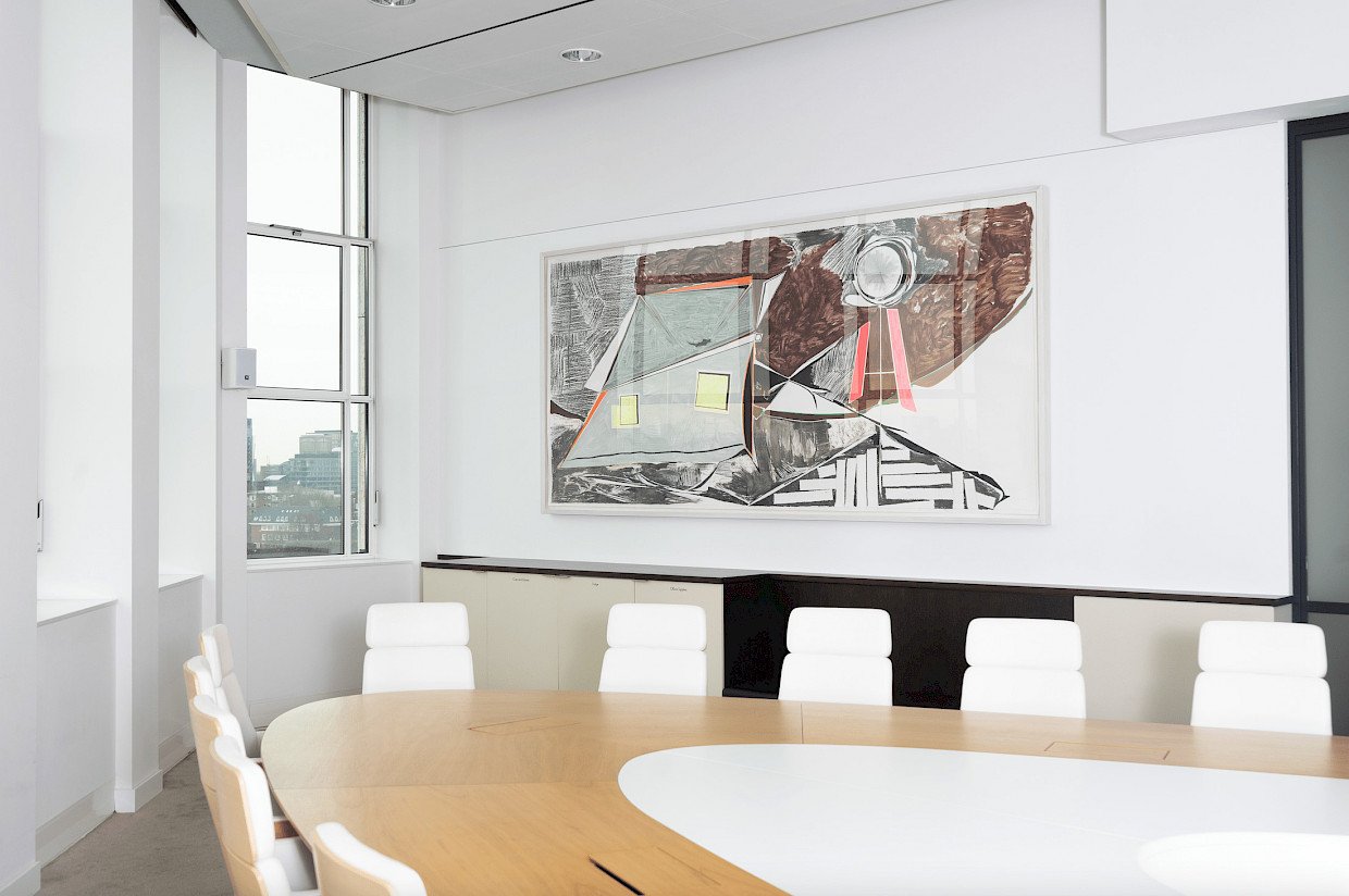

Thomas Scheibitz (b. 1968)
Untitled

In 2001, the Stedelijk Museum in Amsterdam showed the exhibition Bannister Diamond by German artist Thomas Scheibitz. The collection was impressive due to the innovative visual language. Paintings were displayed in combination with centrally placed sculptures, made of translucent and coloured plexiglass. Colourful and bright representations of artefacts were projected on the walls, immersing visitors in a multitude of colours and shapes. In the foreword of the catalogue published for the exhibition, Rudi Fuchs (museum director at the time) compares the paintings by Scheibitz with the image visible through a kaleidoscope: pieces of coloured glass that shift and fall against each other when shaken. It’s a striking observation, which applies to a very large portion of Scheibitz’s work and also to Untitled.
The starting point for Scheibitz’s work is, in his own words, “visible reality”. For him, these are usually images taken from visual media such as magazines, television, comic books or postcards. He completely transforms these images until they speak his own language, with a vocabulary of abstraction and use of colour. This way, Scheibitz creates a consistent and recognisable oeuvre of architectural and abstracted landscape composition.
In Untitled, we can distinguish the contours of a house with light shining inside and a more difficult to identify object, which could represent a simple windmill or an antenna. This image of a lonely lit house is reminiscent of the film Datcha by Rebecca Digne, also part of the A&O Shearman collection. In contrast to the romantic portrayal of solitude in Datcha, Scheibitz is concerned with formal artistic aspects such as the construction of air and light by the use of colour and shape.
Striking in Untitled is the combination of charcoal with oil paint. Each individual element has its own shading, structure or colour. Because of this fragmentation, a delicate depth-effect is created in a work that only just falls within the limits of what one would still consider compositional. This depth is almost necessary for a work this monumental in size, to help direct the gaze of the viewer and to retain their attention. Neither the colours, nor the grey charcoal tones of the charcoal, completely cover the canvas, producing an effect of plentiful thin light in the work. Surprisingly, though, the work’s presence in the grand meeting room is immediately striking, despite the fact that the space receives an abundance of daylight. The work’s absence was very noticeable when it was sent for frame-renovation purposes. It’s nice how a work of art can somehow feel like a close family friend.