
Tommy Grace (b. 1979)
Ad Ex

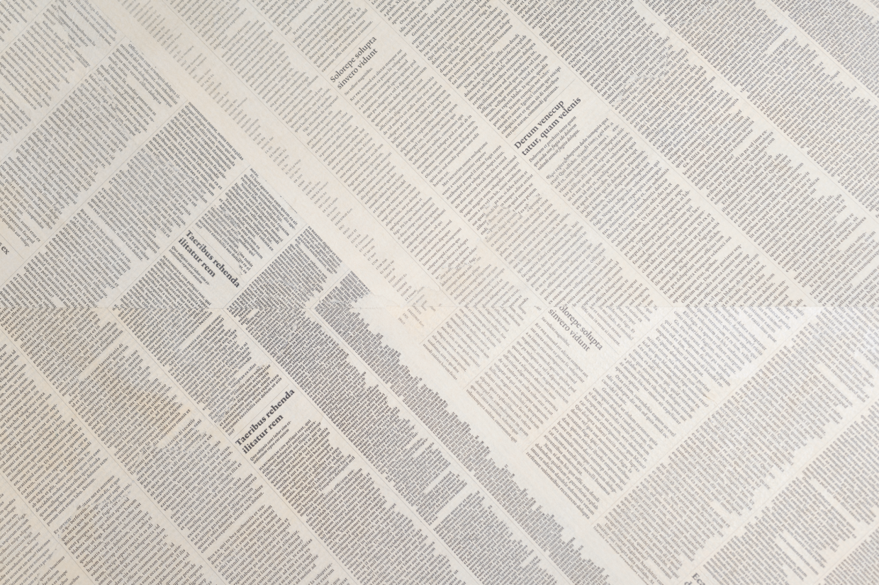
Ad Ex was the first work bought and installed after the renovation of the Apollo House in 2011-2012. The acquisition of the artwork also includes its on-site positioning by Tommy Grace himself. The artist’s primary mission was to find his work a suitable spot. The architect of the Apollo House, Dirk Roosenberg, is known for his comfortable buildings with high ceilings and large windows. This creates a beautiful light and shadow play of the original 1930s balustrade on the black parquet, a crucial factor in the decision of Grace’s positioning of Ad Ex.
Ad Ex is an abbreviation of Ad Extremum, which means something along the lines of “to the extreme” or “crossing the limit”. Looking for limits is always an attempt. Whether the artist has succeeded is up to the viewer to decide. Though it is obvious he made a clear choice.
Grace connects two 90-degree angles in a way for a new, solid shape to come into existence, making viewers easily forget the fact the artwork is made of two separate parts. It is a simple yet elegant find. With a drawing on paper, the positioning on the page is often a decisive factor. The same is true here, with a large, white wall as its page. The confident placement is part of the excitement of Ad Ex.
The Latin words create attractive grey shading from a distance and interact almost like paint or watercolour. Upon closer inspection, nothing specific can be read. Typical newspaper items like political statements, journalistic write-ups or advertisements, for example, would detract from the viewing pleasure. They could potentially influence the viewer to the point where one could forget the fact it is shape and colour they’re looking at. Tommy Grace seems to refer to the so-called “shaped canvas” artworks from the 1960s by artists such as Elsworth Kelly, Richard Tuttle and Frank Stella. In art history, these works are described as “coolly abstract, formalistic, geometrical, objective, rationalistic, clean-lined, brashly sharp-edged and minimalist in character”. A shaped canvas-artist isn’t constrained to a square or a rectangle but uses the shape of the canvas as an integral part of the artwork itself. This is done preferably with non-figurative composition, to avoid distraction and interpretation.
If Tommy Grace communicates any vulnerability with the viewer, it is in his choice of material: fragile newspaper.
